7 Portfolio Comparison Software Features That Actually Matter
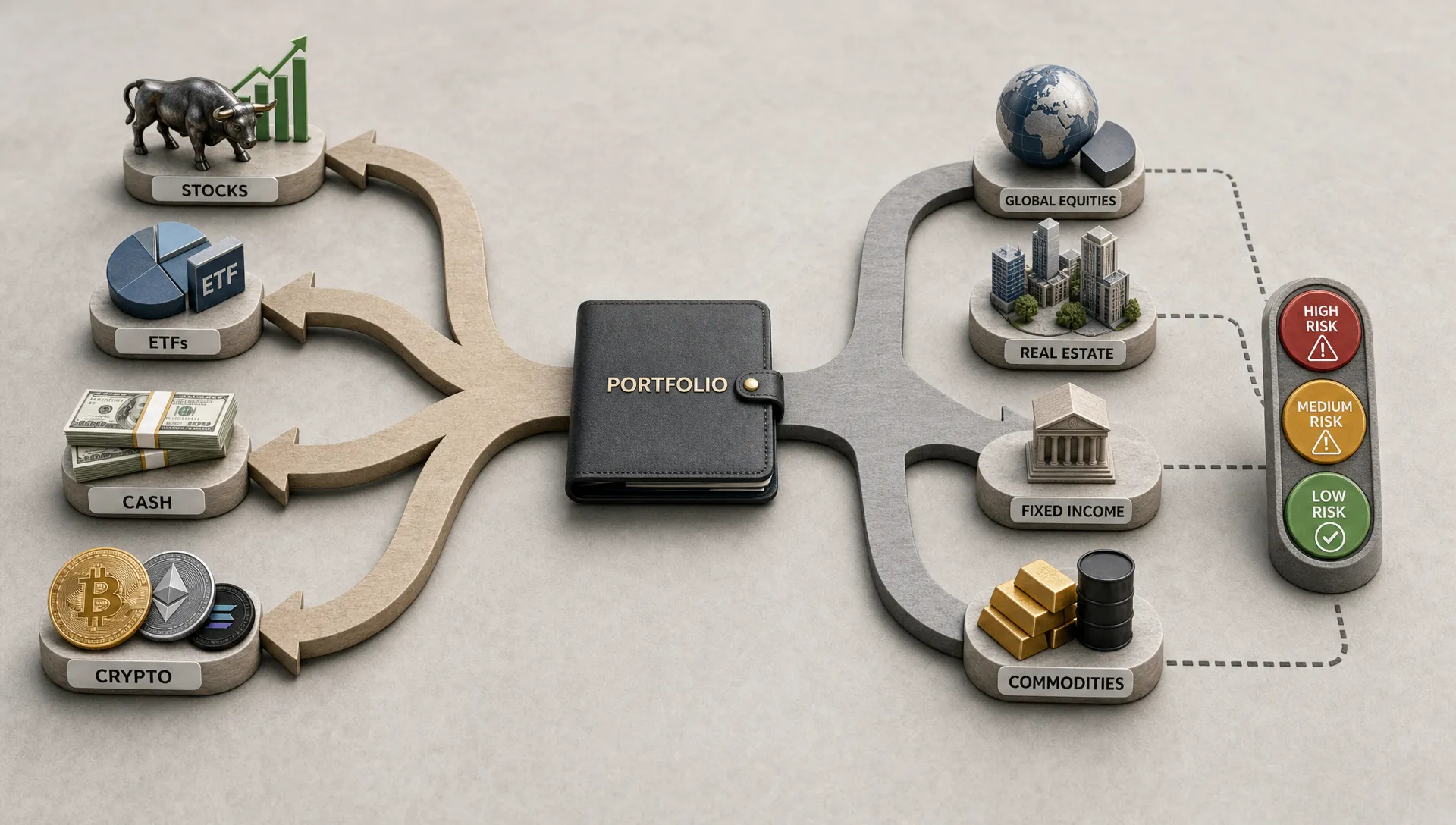
Good portfolio comparison software does more than place two allocation charts next to each other. It should help you understand why your portfolio behaves the way it does, where your risk is concentrated and what other investors are doing differently.
That distinction matters. Most retail investors now own a mix of individual stocks, ETFs, mutual funds, cash and sometimes crypto. A simple pie chart can look diversified while hiding exposure to the same handful of mega-cap stocks, the same sector or the same macro bet. The SEC's Investor.gov explains that diversification can help reduce investment risk, but the hard part is knowing whether your portfolio is actually diversified in practice.
The best portfolio comparison software answers practical investing questions, not just presentation questions. Can I see what is driving my returns? Am I taking more risk than similar investors? Do my ETFs overlap more than I thought? Are top-performing investors moving into themes I have ignored? Does an AI recommendation explain itself well enough to act on?
Below are the seven features that actually matter when comparing portfolio comparison tools in 2026.
| Feature | What it should help you decide | Weak implementation to avoid |
|---|---|---|
| Holdings normalization | Whether the tool understands what you truly own | Only shows account-level balances |
| Overlap and exposure analysis | Whether your diversification is real | Counts funds as separate without looking inside them |
| Relevant benchmarking | Whether you are comparing against the right standard | Uses only a broad index for every investor |
| Risk-adjusted metrics | Whether returns justify the risk taken | Ranks portfolios by return alone |
| Attribution analysis | What actually drove performance | Shows gains and losses without explaining the cause |
| Trend and move tracking | Whether behavior is changing in useful ways | Surfaces popular trades without context |
| Privacy, verification and explainable AI | Whether the insights are trustworthy and safe to use | Makes black-box recommendations from unverified data |
1. Accurate holdings import and normalization
Every useful comparison starts with clean data. If the software cannot read, classify and normalize what you own, every chart after that is built on a weak foundation.
A strong platform should handle common asset types such as stocks, ETFs, funds, cash and crypto if those are part of the investor experience. It should also recognize that two investors can hold the same exposure in different wrappers. One person might own a technology ETF, another might own the underlying stocks directly and a third might hold a broad index fund with large technology weightings. At the account level, those portfolios look different. At the exposure level, they may be more similar than they appear.
Normalization also matters for corporate actions, tickers, fund share classes and currency treatment. A portfolio with incorrect cost basis, stale tickers or duplicated positions can produce misleading return comparisons. Even a small data issue can distort allocation, risk and performance metrics when the position is large.
The test is simple: portfolio comparison software should make the portfolio easier to understand before it tries to make it more impressive. If the first output is a clean breakdown of what you own, how it is categorized and how fresh the data is, the tool is starting in the right place.
2. Real overlap and exposure analysis
Diversification is often overstated because investors compare the names of their holdings rather than the holdings underneath them. Owning five ETFs does not guarantee broad exposure if several funds own the same large companies. A portfolio can also carry hidden sector, factor or geography concentration through funds that appear unrelated on the surface.
Good software should show overlap in more than one way. Holdings overlap tells you whether two funds own the same securities. Weighted overlap tells you whether those shared securities are large enough to matter. Exposure analysis shows whether different holdings create the same broader bet, such as U.S. large-cap growth, semiconductors, long-duration bonds or Bitcoin-related assets.
This is especially valuable when comparing portfolios across investors. If another investor appears to be outperforming, you need to know whether the edge came from genuine stock selection, different sector exposure or a concentrated bet that also carries higher downside risk.
For ETF and mutual fund investors, overlap analysis is one of the fastest ways to find risk hiding in plain sight. Upside has a deeper guide on how to compare funds overlap without missing risk, including why weighted overlap and correlation tell a richer story than a simple holdings list.
3. Benchmarks that match the portfolio and the investor
A benchmark is only useful if it reflects what the investor is trying to do. Comparing every portfolio to the S&P 500 can be convenient, but it is often too blunt. A dividend-focused portfolio, a global allocation, a crypto-heavy account and a short-duration income strategy should not all be judged against the same yardstick.
Better portfolio comparison software lets investors compare against multiple reference points. That can include broad market indexes, custom blends, asset class benchmarks, peer portfolios and verified investor groups. The goal is not to find the easiest benchmark to beat. The goal is to choose a comparison that reveals whether your choices are adding value.
Peer benchmarking is especially useful for retail investors because it adds behavioral context. If verified investors with similar goals are holding more cash, reducing a sector or building exposure to a theme, that information can help you ask sharper questions about your own allocation. It does not mean you should copy them. It means you can compare your assumptions with real investor behavior.
Upside Invest is built around this idea of comparing your portfolio with verified investor data. If you want a more specific walkthrough, its guide on how to benchmark your portfolio against verified investors explains why peer context can be more useful than relying only on broad market indexes.
4. Risk-adjusted performance, not just returns
Return rankings are seductive because they are easy to understand. The highest number looks like the best portfolio. In reality, return without risk context is incomplete.
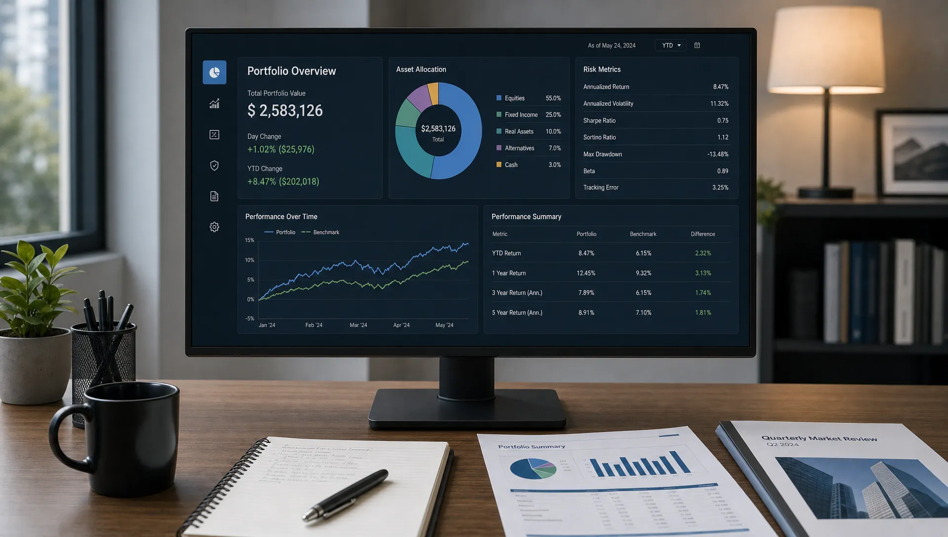
A portfolio comparison tool should include metrics that explain the quality of returns. Volatility helps show how much the portfolio fluctuated. Maximum drawdown shows the worst peak-to-trough decline over a period. Sharpe ratio compares excess return against volatility, giving a rough sense of whether the investor was compensated for the risk taken. Cash allocation, concentration and downside capture can add further context.
None of these metrics is perfect. Sharpe ratio can punish volatile strategies that still fit an investor's goals, and drawdown depends heavily on the time period selected. Still, a platform that shows only return is encouraging shallow comparisons. A platform that shows return, volatility, drawdown and risk-adjusted metrics helps investors ask better questions.
This matters most when evaluating top performers. A verified investor who gained 35 percent with a highly concentrated portfolio may not be directly comparable to an investor who gained 14 percent with lower volatility and better downside control. Both outcomes can be valuable, but they serve different risk profiles.
For a broader framework, Upside's guide to portfolio comparison tips that reveal hidden risk covers why return comparisons should be paired with concentration, overlap and benchmark analysis.
5. Performance attribution that explains the why
The most useful comparison is not simply whether one portfolio beat another. It is why.
Performance attribution breaks results into drivers. Did the portfolio outperform because of asset allocation, security selection, factor exposure, timing, cash management or one oversized winner? Did underperformance come from poor stock picks, being underweight a strong sector or holding too much cash during a rally?
Without attribution, investors often learn the wrong lesson. A portfolio that outperformed because of a single concentrated position may look like evidence of skill, when it may also reflect higher risk. A portfolio that lagged because it avoided an overheated sector may still be aligned with its investor's goals. The explanation matters.
Good attribution should be readable without requiring institutional training. Investors should be able to see which positions contributed most to return, which sectors helped or hurt, how much concentration influenced the outcome and whether the result was repeatable. The best tools connect the numbers back to decisions an investor can actually make.
A practical attribution view should answer questions like these in plain language: What drove my return this month? Which holdings added risk without adding much return? Where did my portfolio differ most from my benchmark? Which decisions appear intentional and which ones may be accidental?
6. Trend, momentum and investor move tracking
Markets move quickly, but not every popular trade is meaningful. Portfolio comparison software should help investors separate signal from noise.
Trend tracking is useful when it shows how verified investor behavior is changing over time. Are high-performing investors increasing exposure to a sector? Are they trimming crowded positions? Are they rotating from individual stocks into ETFs? Are they adding cash after a large run-up? These behavioral shifts can provide context that price charts alone do not show.
The quality of this feature depends on three things: data freshness, investor verification and context. A delayed or unverified signal can be misleading. A trend without position size can also be weak, since a 0.2 percent starter position is very different from a 12 percent conviction holding.
Alerts can be valuable when they are tied to meaningful portfolio changes rather than every small transaction. For example, an alert that top-ranked investors are materially reducing exposure to a stock you own is more useful than a notification that someone bought a fractional share. The tool should help you notice important changes without turning your investing process into a feed of distractions.
Trend and momentum features should never replace your own thesis. Their job is to show what other investors are doing, how behavior is shifting and whether you should revisit an assumption.
7. Privacy, verification and explainable AI recommendations
Portfolio comparison requires trust. Investors are understandably cautious about sharing financial information, and they should be. A strong platform needs privacy built into the product, not added as a marketing line.
For community-based comparison, anonymous verified profiles are especially important. Verification helps establish that the portfolios being compared are real. Anonymity helps investors benefit from the data without exposing personal financial details. Without both, the community layer becomes less useful. Unverified portfolios can be aspirational, incomplete or selectively edited. Fully public portfolios can discourage participation from people who would otherwise share valuable information.
AI recommendations add another layer. AI can be helpful when it summarizes portfolio differences, identifies concentration, suggests areas to review or explains how a portfolio compares with similar investors. It becomes risky when it produces confident recommendations without showing the inputs, assumptions or trade-offs.
The standard for AI in investing should be higher than novelty. The output should be explainable, tied to verified data and framed as decision support rather than certainty. For a broader lens on evaluating AI tools by practical workflow value, resources like AIMarketer Hub's AI-driven marketing techniques offer a useful comparison point, even though investing tools require stricter attention to risk, privacy and suitability.
When evaluating AI features in portfolio comparison software, look for explanations that connect recommendations to your actual holdings. A useful suggestion might say your portfolio is heavily exposed to one sector through both direct stocks and ETFs. A weak suggestion might simply say to buy or sell something with no context.
A quick evaluation checklist
Before choosing a tool, test it with your real investing workflow. The right software should make your next decision clearer, not just make your portfolio look more polished.
| Question to ask | Why it matters |
|---|---|
| Does it analyze underlying holdings? | This reveals hidden overlap inside ETFs and funds |
| Can I choose relevant benchmarks? | Broad indexes may not match your strategy |
| Does it show risk-adjusted results? | High return may come from high concentration or volatility |
| Are peer portfolios verified? | Real investor behavior is more useful than self-reported claims |
| Does it protect privacy? | Portfolio sharing only works if investors can participate safely |
| Are AI outputs explained? | Recommendations should be traceable to data and assumptions |
| Can it track changes over time? | One-time snapshots miss rotations, trends and risk drift |
The strongest sign of quality is decision clarity. After using the software, you should know what changed, what risk you are taking, how you compare with the right reference group and what deserves a closer look.
Features that sound good but matter less
Some features look impressive in demos but have limited investment value. A beautiful dashboard is useful only if the data underneath is accurate. A daily market feed is helpful only if it connects to your actual holdings. A single portfolio score can be convenient, but it can also oversimplify complex trade-offs.
Be careful with tools that lead with social popularity instead of verified behavior. Popularity can point to a trend, but it does not prove quality. The same caution applies to AI-generated scores, risk labels and generic recommendations. If the tool cannot explain how it reached the output, investors should treat the result as a prompt for research rather than a conclusion.
The best portfolio comparison software does not try to remove judgment from investing. It improves the quality of that judgment by providing cleaner data, better context and more relevant comparisons.
Frequently Asked Questions
What is portfolio comparison software? Portfolio comparison software helps investors compare allocations, holdings, performance, risk and benchmarks across portfolios. The best tools go beyond charts by showing overlap, exposure, risk-adjusted returns and how your portfolio compares with relevant peers or verified investors.
Why is holdings overlap important? Holdings overlap shows whether different funds or portfolios own the same underlying securities. This matters because a portfolio can look diversified across many tickers while still being concentrated in the same companies, sectors or themes.
Is peer benchmarking better than using the S&P 500? Peer benchmarking is not always better, but it can be more relevant when your strategy does not match the S&P 500. A good tool should let you compare against indexes, custom benchmarks and verified investor groups so you can choose the right context.
Should I trust AI portfolio recommendations? Treat AI recommendations as decision support, not instructions. Useful AI should explain which holdings, benchmarks, risks or peer behaviors led to the recommendation. Avoid tools that make confident suggestions without showing the reasoning.
What is the most important feature for retail investors? Accurate holdings and exposure analysis come first. If the software does not understand what you own, its benchmarks, risk metrics, peer comparisons and AI recommendations will be less reliable.
Compare portfolios with better context
Portfolio comparison software should help you see your investments more clearly. The features that matter most are the ones that reveal true exposure, compare you with the right benchmarks, show risk-adjusted performance and protect your privacy while using verified investor data.
Upside Invest is designed around those principles. It helps retail investors compare portfolios, view verified investor holdings, track trends, review return and Sharpe metrics and use anonymous profiles for privacy-conscious community benchmarking. If you want comparison that goes beyond surface-level charts, Upside Invest gives you a clearer way to understand what you own and how it stacks up.